Tuesday, September 20, 2011

U.S enroute to Del Rio, Texas, 1955, Robert Frank

The New Mothers, 1989, Sally Mann

Île St. Louis, Paris, Richard Avedon

Rue d'Alésia, Henri Cartier Bresson

The Little Mermaid, Disney Dreams, Annie Leibovitz

1. Explain what it is that you like about these 5 art works.

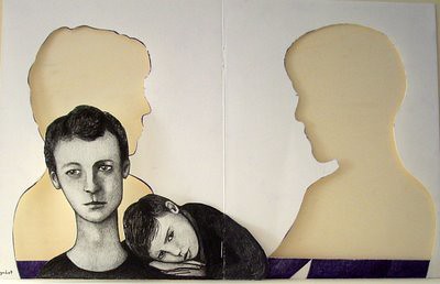
All the artists I was supposed to research had a lot of amazing pieces. However, I chose those five pieces because something about them caught my attention more than the other works. All of these paintings have some form of surrealism in it. I was surprised because most of the work I liked was mainly black and white except one. What I liked most about these pictures was that they focused mainly on one colour, which is what I would like to do with my pieces as well. I also like how the pieces fit well together as they portray different ideas in society. Glamour, sorrow, joy and loneliness. Every piece can be interpreted in many ways which I find very interesting as well. My favorite picture is the one titled “New Mothers” by Sally Mann as it portrays today’s culture and how the soul seems to have left the human body.

2. What is it that these elements are expressing?

The use of one particular colour is trying to invoke a certain type of feeling in us. Black and white are used to create a melancholic feeling towards the painting while the blue is trying to invoke a sense of calmness within us. The use of colours is minimum, though they are vivid. They way they use the colours manages to capture their subject very gracefully which is another quality that I like about these paintings.

3. How could you take some of these strategies and apply them to your own work—either in terms of media, formal qualities, and/or themes?

I really like the way these artists have focused on using one colour to portray a particular emotion, I want to try that with my work as well and see how it goes. I also like the compositions of my art pieces, as the subjects of the paintings have an aura about them that makes the viewer want to keep looking at them. The use of black and white has made me realize that black and white has shown that these two clours are capable of capturing a wide variety of emotions depending on the shades. I might be interested in working with that as well.

4. Choose one artist and research what has influenced his or her work. I f the artist is alive and has a website you should look at what they’ve written about their work. If the artist is not contemporary, then research what others have written about this artist.

The artist I chose to research was Sally Mann as I believe that her work is most inspiring and deals with a variety of subjects. She tends to give a twist to whatever she works on. The composition of her photographs are mainly dark. She uses dark humor to portray pressing issues of the moment. The piece I have chosen is one of her early works, which portrays one of today’s pressing issues teenage pregnancy. She has had two documentaries made about her, Blood Ties, in 1994 and What Remains in 2007. Moreover she is a talented woman and has also written many books the latest one being Immediate Family which she is writing to clear the air about her artwork which most people find disturbing.


Monday, September 19, 2011

Sanjana Datla

Jennifer Levonian, Take a Picture with the Puma, Oil-Collage, 2010

Georgia O'Keeffe, The Black Iris, Oil Painting, 1926


Mary Cassatt, The Two Sisters, Oil Painting, 1884


Andrew Wyeth, Siri, Oil Painitng, 1970


Kelly Falzone Inouye, Chain Gang, Water Color, 2005


1. Explain what it is you like about these 5 artworks (elements/common threads).
All the artists I looked at had so many amazing pieces of art that it was really hard to choose. I chose these five artworks because all of them managed to provoke very strong emotions and capture my attention. Three of the five painting I chose have a lot of white/positive space but this adds to their art than hinder it. I love how all the artists play with light and how white can have so many colors in it. I think all my pieces contrast each other for I liked them for different reasons. I liked the vividness and emphasis on the pots and plates in the Take a Picture with the Puma by Jennifer Levonian. My favorite art movement is impressionism so I immediately connected with Mary Cassatt’s work, in The Two Sisters I like how it is reminiscent of Edgar Degas and the contrasting color scheme. I loved The Black Iris for its ambiguity and the fact that it was created using three colors. I chose the Chain Gang, for its portrayal for connection and uniformity not only through chains but through structure and colors. And lastly I loved Siri for the way the light is shone and the positioning of the central figure; it is very aesthetically pleasing that the girl is place in the bottom half of the painting while the top have concentrates on the play of light on white walls. The common thing I light about all the artworks is the use of the white, the positioning of the subjects and the use or lack of color.

2. What is it that these elements are expressing?
I always thought color scheme is central to evoking emotion. There is a lot of pathos in these artworks and this is achieved via the colors. The vivid and contrasting colors capture the abstractive and fleeting quality they have. While the minimal use of color in three of the art pieces manages to intrigue the observer and draw attention to the details and the use of light.


3. How could you take some of these strategies and apply them to your own work -- either in terms of media, formal qualities, and/or theme?
In my art I want to work on strange positioning of the subjects in order to draw attention. I also want to try using minimal colors in at least a couple of art pieces because I always loved using all the colors I could find. Another concept I want to experiment with is the use or lack of light in a painting. Light has the power to reveal or hid so much and I want to see how I can use light it portray emotions and thoughts. I want to learn how to let my hand go and create very abstract brushstrokes and on the other extreme I want to also create the true water color effect, where the characters look like they can dissolve any second.

Part 3: Artist In-Depth
3. Choose one artist and research what has influenced his or her work. If the artist is alive and has a website you should look at what they've written about their work. If the artist is not contemporary, then research what others have written about this artist.
Mary Cassatt
She is an impressionist artist born in 1844. Her work largely concentrates on the relations between people or family members, usually between a mother and child. I love when women are made subject, because they are usually illustrated in such detail and clarity that it feels like a part of their (the subject’s) soul is relieved to the viewer. This is the primary reason I love impressionism and artists like Edgar Degas, Van Gogh, Mary Cassatt and Auguste Renoir, they capture the essence of moment or a person through the abstract colors and brushstrokes. Mary Cassatt was extensively influenced by Edgar Degas. Much of her early work is very reflective of his style. Her other major inspiration is women themselves, she liked portraying women holding different relations

Zarka Shabir

Shirin Neshat. Seeking Martyrdom. Pen and ink on photograph. 1995
Simeen Farhat. Expulsion. Fabric, painted wood and wire.2009
Hunter Stabler. Cymatic Donut Lattice Interior 1. Graphite on paper. 2007
Philip Taaffe, Konya, Mixed media on linen, 2009
Valerie Jaudon. A Machine For Living IV. Acrylic and Water color on paper. 2008


Explain what it is you like about these 5 artworks (elements/common threads).

The reason why I chose these five artworks is because, in one way or another, all of them represent contemporary Islamic art. The common thread in the images would be the use of Muslim/Middle Eastern culture. Islamic art is connected to my concentration as well and I am constantly thinking about it which is another reason why these pictures stand out most for me. Other than Philip Taaffe’s painting, they do not contain any prominent colors and are rather muted. It is the shape of the painting or the sculpture that is given primary importance which is what calligraphy is about as well. I believe it is these ties that make these images appealing to me.

What is it that these elements are expressing?

The work of these artists seems to be related to Arabic or Persian culture in one way or the other. Looking at the more blatant works of Shirin Neshat and Simeen Farhat, Muslim women are depicted as self sacrificial yet strong. Both images use extreme contrasting color combinations of white or black and red, again in both cases, to depict blood. In Neshat’s photograph, a woman is depicted as a killer which blood on her hands and the impression Farhat’s sculpture gives me is that the woman has been injured in battle and is wounded. Both these women are soldiers in themselves, which is ironic because women are generally not empowered enough to retaliate in Islamic cultures. The other three works by Valerie Jaudon, Phillip Taaffe and Hunter Stabler are all patterns or abstractions. Looking at Hunter Stabler’s image, the infinite hourglass shape he has created reminds me of the domes of mosques. When inverted to fall on top of each other they may create a similar shape. Valerie Jaudon’s work actually looks like abstract Urdu calligraphy as the shapes are very similar to words. The painting in itself may be depicting a variety of themes but the reason I can connect this image to Islamic Art is because I remember seeing similar carving on the borders of the Taj Mahal as a child. Lastly, Philip Taaffe’s work is an exception to the general lack of color. It forms a kaleidoscopic image, highly intricate and colorful. This pattern is often found on the ceilings in mosques and gives a sense of hypnosis (which is considered crucial to religious devotion) thus drawing the viewer in. In one way or another I can connect all of these elements to Islam or the Middle Eastern culture.

How could you take some of these strategies and apply them to your own work -- either in terms of media, formal qualities, and/or theme?

I really like the idea of using commonly used patterns to create art. I would like to incorporate Philip Taaffe’s and Hunter Stabler’s style of using pattern to create shapes in my portfolio. I would also like to incorporate the themes that they have used; the shapes they use are not realistic and thus leave the meanings to the viewer’s interpretation. It is a different kind of art altogether and I admire them for the risks they have taken. I too would like to make my art as bold as theirs, through a constant process of risk-taking.

Artist In-depth:

The artist I chose is Simeen Farhat and the image I posted above is called “Expulsion.” Despite being an American immigrant, Farhat is still in touch with her Pakistani heritage and describes her identification with two cultures as a, “complex subject expressed in a variety of media.” She works in installation work, sculpture and drawing. Having read her artist’s statement, it seems that Farhat uses art to express the connections she has with her homeland. Most of her work depicts veiled woman, a part of the Pakistani culture she, “both shares and [has] a distance from,” and textual paintings incorporating the works of renowned Urdu poets like Faiz Ahmed Faiz and Mirza Ghalib. I really like the way Simeen Farhat is absolutely fearless in her work. She highlights controversial issues in her sculptures of women by depicting them as hollow figures. Further, though the poems of Faiz and Ghalib are known for their serenity and devoutness she arranges the text in shapes that look more like bursts of energy than anything else, thus completely altering the conventional perceptions of these poems. Personally, I think her art is a triumph. She takes it beyond the judgment of society and seems to be on a higher plane of courage.

"Artist's Statement - Simeen Farhat." Gallery: Current Work - Simeen Farhat. Web. 18 Sept. 2011. .

"The Drawing Center - Viewing Program." The Drawing Center | Exhibitions-Current | New York, NY. Web. 18 Sept. 2011. .

"Works on Paper." Valerie Jaudon. Web. 19 Sept. 2011 .

"Philip Taaffe | Gagosian Gallery in Athens 2010 | Breathtaking Athens - The Official City of Athens Visitors' Website." Athens Greece | Breathtaking Athens. Web. 19 Sept. 2011. .

"SHIRIN NESHAT B. 1957 Seeking Martyrdom, Versi." Bid in Online Auctions - Live Auctioneers. Web. 19 Sept. 2011.

"The Drawing Center - Viewing Program." The Drawing Center | Exhibitions-Current | New York, NY. Web. 19 Sept. 2011. .


Christine L. Lungalang

PART 1 :

Kyung Jeon - detail of "Waterlilies" - water color/pencil Aug. 7 2011


Karen Moss - part 3 of 3 from "Street Life" - collage & acrylic paint on paper (24.5" x 157")

2009


Gale Gibbs - An Irritating Red Bird in the House - c-print (16" x 20") 2011


Jennifer Delilah – Unfamiliar Desire – oil on linen (29” x 21”)


Mark Joshua Epstein - It Was Sad When The Great Ship Went Down - Oil on Canvas (60"x48") 2011
PART 2:
Q1. Exaplin what it is you like about these 5 artworks (elements/common threads)

In general, I like the simplicity in these art works. I like the limited use of color, with the exception of the one by Jennifer Delilah - Unfamiliar Desire. The rest of them relate to my personal style through the less intricate, and simple techniques used by these various artists.

Q2. What is it that these elements are expressing?
These elements all express quite various things. However, the factor that, in a way, ties them together is their simplicity. The first one by Kyung Jeon is very much like my personal style. This is because I like to draw things off the top of my head, but also take images from actual photographs that I take. Also, the second one by Karen Moss, the third by Gale Gibbs, and the fifth one by Mark Joshua Epstein, all are very limited in color. There is only one dominant color throughout each individual artwork. The fourth one by Jennifer Delilah seems to be the most different, but the thing that stands out is the use of patterns and various colors. I like this one quite a lot because of its odd but interesting use of patterns and colors. These all, although some more abstract than others, emits a sense of everyday reality.

Q3. How could you take some of these strategies and apply them to your own work -- either in terms of media, formal quatlities, and/or theme?

I could continue to have the limited-color technique in my following artworks. I could also maintain the simplicity, because that is my personal style. Although my concentration is Black and White Memories, I could try to make my artwork a little bit more abstract and see how that works out.

PART 3: Artist In-Depth
Choose one artist and research what has influenced his or her work. If the artist is alive and has a website you should look at what they've written about their work. If the artist is not
contemporary

Kyung Jeon, a Korean-American artiste, was born in 1975 in Jersey City, New Jersey. She went to various art schools including ones in New York City, NY, and Boston, MA. Her artworks consists of cartoon-ish little characters. In her work, she tries to explore various mediums, including rice paper and vinyl. Jeon's work is influenced by sources such as childrens' fairytales, traditional Korean-genre paintings, and the eccentric worlds of Henry Darger and Heironymus Bosch. She includes the various characters who play out various scenarios in a full spectrum of emotions.


Bibliography:


Peter Phillips, Lion versus Eagle, Oil and collage on canvas, 1962, h: 82.68 x w: 59.06 in
Rosalyn Drexler, The Defender, Acrylic and paer collage on canvas, 1963, 40" X 50"

Derek Boshier, The Dinner Party, Arcylic on paper, 2007, 46" X 72"


Sercan Sahin, Glass Dreams, Mixed, prints on paper, 1996, 22" X 30"


Peter Max, Songs of the Beatles, 1995, 30" x 20"


1. Explain what it is you like about these 5 artworks (elements/common threads).
These 5 prominent artworks consist of great color combinations and include depth details. Moreover, the balance texture of color and the expertise quality painting techniques are just eye catching.

2. What is it that these elements are expressing?
There are numerous interesting elements that these 5 artworks are expressing. Firstly, the artwork by Peter Max expresses a great deal of content. Just by looking at the audience gains a sensation of joyfulness and comfort (more here). Although the second piece does not include various colors as the rest, it expresses an emotion of satisfaction and clam. The print of the little paper boat gives a sense of calm and relaxation, while on the other hand, the two faces show no expression, but an expression of calmness. The third piece, which is probably my favorite, is really interesting. The combination of animal heads with a human bodies and just the random fishbowl as a head, expresses an element of cooperation. Although each character is different in various ways, all the character shows no expression of anger or judgment. The characters seem to be comfortable with each other and what enjoy each other company. The first and the second piece seem to share the same quality of elements. Both pieces expresses a sense of defense and patriotism but at the same time the bright background color illustrates a content feeling. It makes the artwork comfortable to look at as an audience and easy to approach.

3. How could you take some of these strategies and apply them to your own work -- either in terms of media, formal qualities, and/or theme?
As seen in my pervious artworks, I have tried to fill my background with bright colors to express a feeling of calmness. However, some strategies I could apply to my own work would be the balance of the color and the texture of color I apply on my artwork. I have found it difficult to find the right colors to fill my background but this has definitely given me a better understanding. Moreover, in terms media or theme this art pieces has widen my ideas on what I could possibly illustrate on my future work. I thought have painting all my artwork but seeing the prints has definitely changed my mind.

Part 3: Artist In-Depth
3. Choose one artist and research what has influenced his or her work. If the artist is alive and has a website you should look at what they've written about their work. If the artist is not contemporary, then research what others have written about this artist.
From the five artists, Peter Max was definitely the most interesting. He’s work is eye catching, bright and colorful. In his website he quoted “When I approach a canvas, the only thing I anticipate is being… surprised!” which is exactly what he illustrates in his art pieces. Peter’s was influenced by his mother was a fashion designer. She left Peter at home with many art supplies such as watercolors, ink, pencils, crayons etc, which got Peter interested. Peter’s mother always told him “Choose any balcony and medium, make a big mess and we’ll clean up after you” with constant encouragement from his family Peter continued to produce art. Later in his life while Peter was visiting Mt. Camel Observatory, he was fascinated with astronomy and his parents instantly enrolled him into evening classes. Peter then began studying astronomy and art concurrently, which is why we still see many astronomy theme conveyed in his artworks. During the 1960s, Peter began studying in Manhattan under his teacher Frank Reilly who was a realistic painter. Peter quoted “Reilly was a great technician, he was scientist of light and shadow…” he was influenced by Reilly and spent weekends taking classes at 8am and 8pm. Peter influenced by Reilly also quoted “It gave me the gift of observation”.


Hyeeun Cho

Part 1: Top 5Jennifer Viola. "Self-Portrait with Sponge Bob Pillowcase" Gouache, pencil, acrylic, pen on paper. 24"x 18" 2010


Dana Harel. "I am not an animal 1". graphite on paper. 45"x 66" 2010


Laura Mosquera. "A Beautiful Ritual Unfolds" graphite on clayboard. 12"x 38"x 1.5" 2/2010

Suzanne Sattler. "Passive Poker" pencil on paper. 30"x 40" 2010
Piet Mondrian. "Self-Portrait"charcoal on paper. 28x 23cm 1912

Part 2: Synthesize
1. Explain what it is you like about these 5 artworks (elements/common threads).

All these art works are on faces. Most of the faces are covered and one of them only have the basic structure of the face. Covered face connects well with my concentration. These are detailed and realistic (except for the last one.) They use one medium except for the first artwork.


2. What is it that these elements are expressing?

Covered face and the basic structure of the face show that something is hidden. The elements express a sense of secrecy. By using one medium such as charcoal and pencil, the artists give a sense of calmness to the drawings.

3. How could you take some of these strategies and apply them to your own work -- either in terms of media, formal qualities, and/or theme?

I have already used pencil so I think I am going to experiment with charcoal on next concentration. I am also going to add not only people hiding their faces but also put just the basic structure of the face like the self-portrait of Piet Mondrian. To make the qualities of the pencil drawings better, I am going to make them look more realistic by adding more details. I am also going to continue putting the patterns like the second concentration I did in my pencil drawings.

Part 3: Artist In-Depth
3. Choose one artist and research what has influenced his or her work. If the artist is alive and has a website you should look at what they've written about their work. If the artist is not contemporary, then research what others have written about this artist.

Laura Mosquera had different series of works and I only focused on "The Thick Of it." She tried to capture the moment of our life when it changes the direction or become clear. She drew different face expression to show different emotions of people. Some of her works such as "Somewhere in between" have patterns as the backgrounds. She said those shapes "articulate new and unexpected space."

http://www.mutualart.com/Artwork/Self-Portrait---Zelfportret/51518CC19954FD7E
http://www.drawingcenter.org/viewingprogram/portfolio.cfm

Luniva Shakya


Part 1: Top 5

Jason D. Watson, Blindspot,
 graphite colored pencil, acrylic wash, gouache on paper,
2009, 50 " x  38 " 


Cecy Colichon, Visions STLS IV,Oil Painting, 2005  
 
Yeshe Parks, Pull, Mixed, 2007, 9" x 12" 
 
 Karla Knight, The Farmer, Oil on Wood, 1985, 18” x 19”

Daniel Hill, Untitled #13, acrylic polymer emulsion on paper mounted on canvas, 2009, 40” x 50”


Part 2: Synthesize


1.       Explain what it is you like about these 5 artworks (elements/common threads).
In these pieces there is a definite sense of human as well as otherworldly realities that are portrayed either by creating illusions (‘Untitled #13’ – Daniel H ill & ‘The Farmer’ – Karla Night) or by juxtaposing various possible scenes with bizarre or unrealistic ideas (‘Pull’ – Yeshe Parks & ‘Blindspot’ - Jason D. Watson). The complexity and diversity incorporated in each of each of them portray some sort of intangible world that is mesmerizing. They have certain elements that make the piece stand out: things like bold empowering colors, use of space and lines, as well as tone are some of the certain aspects that I find remarkable in these artworks.
2. What is it that these elements are expressing?

There is a surreal element to each of the images that display different things in different ways. The geometrical lines and use of space creates this aura of absurdity that is peculiar but still appealing to the eye – it makes one think of the complexities of mathematics! There is originality in the way the artists have included the random objects in such a way – it makes viewers look at the artwork at different levels so to understand the piece. There is a sense of experimentation, a sense of how the creator has incorporated complicated visions and dreams of their own onto canvas. Though they are all quite different from each other I feel that there is definitely a surrealistic idea behind each of them. They all express the message of obscurity and ambiguity. 

3. How could you take some of these strategies and apply them to your own work -- either in terms of media, formal qualities, and/or theme?

Their surreal ideas as well as their boldness to create something unheard/unseen of is something that has motivated me to continue being more creative with my pieces for my concentration. I love how the pieces have this extraterrestrial feel that is mysterious but capturing at the same time. Though they are different in their use of medium, I hope to show more correspondence between my works. I now encourage myself to practice my art and possibly focus using only a few mediums (ie. acrylic, oil paint and charcoal). I will also now be aware of how I use the canvas space as well as lines and regular shapes to create a more ‘futuristic’ look that will captivate my viewers. I also hope to adopt the theme of juxtaposing realities and dreams to portray what my visions of the future will be.  

 
Part 3: Artist In-Depth

3. Choose one artist and research what has influenced his or her work.  If the artist is alive and has a website you should look at what they've written about their work.  If the artist is not contemporary, then research what others have written about this artist.

Cecy Colichon’s work, as she says so herself, comprises of “an aspect or puzzle piece to a larger concept” – I really like this outlook on her basis of work. Her early works consisted of “geometrical, planar and mechanical forms that express 2D and 3D volume relationships that appear to move in two directions at the same time” – her style is very surreal and I never fail to become captivated by it. Her visual effects give this feel of mathematical order that is superbly represented. Her interest lies in the fields of Theoretical Physics, Biology and Theology – she has the desire to express spiritual elements as well that she was inspired by from her native Peruvian heredity. I too hope to incorporate the religious and cultural aspects of my life in my artwork.
To end, I would like to include a quote I really liked from her:
“Although the scientific method in the strictest sense involves the testing of finite ideas with measurable parameters, I believe that the creative process towards discovery in science also involves a degree of intuition. Intuition is an essential element ...”

Gojen

Part 1: Top 5
Choose your favorite artworks from five different artists (they should all be from the list of artists you received). Make sure you include Artist's Name, Title, Medium, Date.


Derek boshier, The New Mad Donas,Oil on canvas,1986


Leon Golub,Bones,Oil stick and ink on Bristol,2002


Nancy Spero,La Folie ll,Ink & handprinting on collage,2002


Romare Bearden,All the Things You Are,Water Color and Collage on paper,1987


Stuart Davis,New York Mural,Oil on canvas,1932


Part 2: Synthesize
1. Explain what it is you like about these 5 artworks (elements/common threads).
I like how at the first look, it doesn't seem to make sense and that the images all look like the objects and the people in it are misplaced or randomnly put together. However, if looked at carefully, everything ties together and creates a story that the artist is trying to tell to the public through his/her paintings. All the paintings seem to show a form of surrealism making it look dream like. I also like how all use different types of brushes and brush strokes, the intensity of the colors that create depth, and a dominance of color in each painting which makes it more eye catching.

2. What is it that these elements are expressing?
These elements express imagination, story,truth and mankind. The paintings show different parts of everyday life almost like a picture, an emotion or a visual story. Even though the images are simple, the arrangement makes it seem unreal.The images are realistic and easy to identify which leaves the interpretation of the painting up to the viewer.

3. How could you take some of these strategies and apply them to your own work -- either in terms of media, formal qualities, and/or theme?

I intend to use some form of surrealism in my piece as many of the things in my painting are arranged in more of a fantasy manner. Since my theme is music, i would like to focus on a narrative painting in which the images show the power of music, almost like a visual story.

Part 3: Artist In-Depth
3. Choose one artist and research what has influenced his or her work. If the artist is alive and has a website you should look at what they've written about their work. If the artist is not contemporary, then research what others have written about this artist.

Leon Golub was an American artist whose work was strongly influenced by the harsh treatment and brutality of mankind, political corruption and power. He focused on violence of many forms such as murder, brothels, racial and gender inequality, and torture chambers. He also lived through the Vietnam War so his perspective on all these disturbing issues can be seen through his dark and upsetting paintings. Therefore his paintings included of both specific and general violence issues. It is said that Golub often painted in a "unique figural style" as the figures in his paintings are modified from athletes, Greek and Roman scultpures and gay pornography. Golub wanted to paint the truth and aware the people of the violence in the world. He used a sculptural technique to paint as he would layer and then scrap away paint using a meat cleaver.The link below are some of the examples of his paintings.


http://whenisitart.blogspot.com/2009/07/crisis-in-modern-art.html

LINKS

http://popartmachine.com/item/pop_art/MCAS-MCAS.003CS003/DEREK-BOSHIER-THE-NEW-MAD-DONAS-1986

http://artobserved.com/2010/06/go-see-new-york-leon-golub-live-die-like-a-lion-at-the-drawing-center-through-july-23rd-2010/


http://tsunamon.blogspot.com/2011/04/nancy-spero-at-serpentine-gallery-2nd.html


http://www.artnet.com/artwork/425993817/all-the-things-you-are.html


http://www.mutualart.com/Artwork/New-York-Mural/81B76948D13F45FB

Nayung


Forbidden Collar II, 2009
Annysa Ng
ink on paper


Tightrope- India Richer


water color


2004


0"x 0"


Guillermo Martin Bermejo


1971


21 x 30


"Paginas Abiertas"


Camera- Maira Kalman


540 x 409


Moon - Aya Takano


Acrylic on canvas


2004
53 x 45.5


1. i really love the simple yet intricate designs and colors used in alll of the these art. All of the artwork focuses on emotions, life and fate.


2. the artwork as mentioned are expressing emotions of love, pain, depression, happines and surreal moments.


3. i would like to add more emotions and color into my body of work. also experimenting different styles of using ink and acrylic to bring more idea of a surreal world.


4. i really like Aya Takano's style of art, the use of basic and subtle colors to bring a sense of surealistic world really interest me. Aya takano uses her culture as a base for all of her art work. i too am using my background of culture as the main idea of my art, therefore it inspires me.


she is also a manga artist, illustrator and a science ifction essayist. her art is simple yet detailed and abstract to some extend.


Links


Nugget


Sung Jin arrives in London 1 145.5x179 cm Inkjet on Canvas 2009

Sailor Moon 36x48 inches Acrylic on Canvas 2004
Almost Too Far Gone 122x183 cm Oil on Linen 2010

Amanda 18x36 inches Silkscreen 2000

Summoning her owls, she looked yonder. The buildings shone.194x259 cm Acrylic on Canvas 2007


1. Explain what it is you like about these 5 artworks (elements/common threads)


These artworks share many common elements. Firstly, they all employ a bold use of color. Some artists like Katz and Mosquera use more vivid and sold colors, while Shimomura, Opie and Takano keep it more pastel and use earthy tones. I also like the slightly cartoonish aspect of it as well. All of these artworks depict a real person, but painted like an illustration. This also goes well with my theme since I am trying to capture movie scenes with real people into a cartoonish piece.

2. What is it that these elements are expressing?

All of these pieces lie on a bridge between realism and cartoon. In some ways, what they are implying are also on that bridge. For instance, in Laura Mosquera's piece, the main subject, the girl, looks tired. She feels a bit wacky. The background behind the girl are comic-like stripes. But in the middle the same lines start doing something wacky, demonstrating the girl's, perhaps, mundane life. The same with Aya Takano's artwork. They are almost like doodles of an outer world, but they represent a very realistic issue in the world.


3. How could you take some of these strategies and apply them to your own work -- either in terms of media, formal qualities, and/or theme?

I would certainly like to incorporate some of the color schemes into my artwork. Also, the juxtaposition of some of the main subjects are very cleverly done. The other thing that I would like to add is some of the simplistic drawing styles that these artists work with. Also, many of them use acrylic paint so I would certainly like to experiment with that medium.

PART 3


1. Choose one artist and research what has influenced his or her work. If the artist is alive and has a website you should look at what they've written about their work. If the artist is not contemporary, then research what others have written about this artist.

I chose to research Julian Opie. Opie wanted to make art that could be displayed on billboards. He is "determined to bring his work to the people". He was not always enthusiastic about art though. "People said I should go to art school," he says, "which I thought was for losers." He did attend art school. He likes his art to be "very passive and very easy, which is something that appeals to me."


URL for pictures
http://www.gregkucera.com/shimomura/yellow_terror/content/Roger_Shimomura_paintings_8_large.


http://lh5.ggpht.com/-9-b6DvzhfMk//1047212111bd01.jpg

http://www.perrotin.com/fiche.php?id_pop=12111&&idart=15&&dossier=Aya_Takano&&num=36&&p=3